2014年12月25日木曜日

AppCompat v7 の version 21 では、Fragment 入れ替えに
android.R.id.content を使ってはいけない

FragmentTransaction.replace() で android.R.id.content に MainFragment を入れる処理です。

  1. public class MainActivity extends ActionBarActivity {  
  2.   
  3.     @Override  
  4.     protected void onCreate(Bundle savedInstanceState) {  
  5.         super.onCreate(savedInstanceState);  
  6.   
  7.         getSupportFragmentManager()  
  8.                 .beginTransaction()  
  9.                 .replace(android.R.id.content,   
  10.                     new MainFragment(), "MainFragment")  
  11.                 .commit();  
  12.     }  
  13.   
  14.     public static class MainFragment extends ListFragment {  
  15.   
  16.         @Override  
  17.         public void onActivityCreated(Bundle savedInstanceState) {  
  18.             super.onActivityCreated(savedInstanceState);  
  19.   
  20.             setListAdapter(new ArrayAdapter<string>(getActivity(),  
  21.                     android.R.layout.simple_list_item_1,  
  22.                     android.R.id.text1,  
  23.                     new String[]{"test1""test2""test2"}));  
  24.         }  
  25.     }  
  26. }  
  27. </string>  

AppCompat v7 の version 19 だと普通に MainFragment が表示されます。
  1. apply plugin: 'com.android.application'  
  2.   
  3. android {  
  4.     compileSdkVersion 19  
  5.     buildToolsVersion "21.1.1"  
  6.   
  7.     defaultConfig {  
  8.         applicationId "net.yanzm.sample2"  
  9.         minSdkVersion 15  
  10.         targetSdkVersion 19  
  11.         versionCode 1  
  12.         versionName "1.0"  
  13.     }  
  14.     ...  
  15. }  
  16.   
  17. dependencies {  
  18.     compile fileTree(dir: 'libs', include: ['*.jar'])  
  19.     compile 'com.android.support:appcompat-v7:19.+'  
  20. }  


しかし、AppCompat v7 の version 21 にすると、でない!
  1. apply plugin: 'com.android.application'  
  2.   
  3. android {  
  4.     compileSdkVersion 21  
  5.     ...  
  6.   
  7.     defaultConfig {  
  8.         ...  
  9.         targetSdkVersion 21  
  10.         ...  
  11.     }  
  12.     ...  
  13. }  
  14.   
  15. dependencies {  
  16.     ...  
  17.     compile 'com.android.support:appcompat-v7:21.0.3'  
  18. }  


悲しみ。。。

レイアウトファイルを用意すれば表示されるけど。。。
  1. <FrameLayout xmlns:android="http://schemas.android.com/apk/res/android"  
  2.     xmlns:tools="http://schemas.android.com/tools"  
  3.     android:id="@+id/content"  
  4.     android:layout_width="match_parent"  
  5.     android:layout_height="match_parent"  
  6.     tools:context=".MainActivity" />  
  1. public class MainActivity extends ActionBarActivity {  
  2.   
  3.     @Override  
  4.     protected void onCreate(Bundle savedInstanceState) {  
  5.         super.onCreate(savedInstanceState);  
  6.         setContentView(R.layout.activity_main);  
  7.   
  8.         getSupportFragmentManager()  
  9.                 .beginTransaction()  
  10.                 .replace(R.id.content, new MainFragment(), "MainFragment")  
  11.                 .commit();  
  12.     }  
  13.   
  14.     ...  
  15. }  


バグなんだろうか。。。

↓多分同じこと言ってる http://stackoverflow.com/questions/27460502/appcompat-v7-android-5-0-actionbaractivity-textview-not-visible


追記: getSupportActionBar() を呼ぶと表示された。。。謎い。
  1. public class MainActivity extends ActionBarActivity {  
  2.   
  3.     @Override  
  4.     protected void onCreate(Bundle savedInstanceState) {  
  5.         super.onCreate(savedInstanceState);  
  6.   
  7.         // これを呼ぶと表示される!なぜだ!  
  8.         getSupportActionBar();  
  9.   
  10.         getSupportFragmentManager()  
  11.                 .beginTransaction()  
  12.                 .replace(android.R.id.content,   
  13.                     new MainFragment(), "MainFragment")  
  14.                 .commit();  
  15.     }  
  16.   
  17.     ...  
  18. }  


2014年12月19日金曜日

Android AlertDialog のボタンの色を変える Material Design 編

■ Lollipop

values/styles.xml
  1. <?xml version="1.0" encoding="utf-8"?>  
  2. <resources>  
  3.   
  4.     <style name="AppTheme" parent="Theme.Material.Light.DarkActionBar">  
  5.         <item name="android:alertDialogTheme">@style/AlertDialogTheme</item>  
  6.     </style>  
  7.   
  8.     <style name="AlertDialogTheme" parent="Theme.Material.Light.Dialog">  
  9.         <item name="android:colorAccent">#61a00e</item>  
  10.     </style>  
  11.   
  12. </resources>  


■ AppCompat

values/styles.xml
  1. <?xml version="1.0" encoding="utf-8"?>  
  2. <resources>  
  3.   
  4.     <style name="AppThemeBase" parent="Theme.AppCompat.Light.DarkActionBar">  
  5.     </style>  
  6.   
  7. </resources>  
values-v21/styles.xml
  1. <?xml version="1.0" encoding="utf-8"?>  
  2. <resources>  
  3.   
  4.     <style name="AppTheme" parent="AppThemeBase">  
  5.         <item name="android:alertDialogTheme">@style/AlertDialogTheme</item>  
  6.     </style>  
  7.   
  8.     <style name="AlertDialogTheme" parent="Theme.AppCompat.Light.Dialog">  
  9.         <item name="colorAccent">#61a00e</item>  
  10.     </style>  
  11.   
  12. </resources>  


2014年12月15日月曜日

MQTT ハンズオンに参加しました。

MQTT ハンズオン http://connpass.com/event/9765/ に参加してきました。

会場はクラウド会計ソフトを開発されている freee さんでした。しゃれおつなオフィスでした。卓球台とダーツがありました。(GTUG Girlsの勉強会でも使えるといいな)

講師の @r_rudi さん、@voluntas さんありがとうございました。

MQTT については時雨堂さんの解説を読むのがいいと思います。


ハンズオンでは大きく分けて2つのことをやりました。
  • mqttcli を使ってみる
  • いろんな言語で MQTT クライアントを作ってみる
当日はハンズオン用のHost(Brokerともいう)が用意されていましたが、復習したい場合は sango の無料プランで試すのがおすすめです。 githubアカウントでログインできるので簡単。


■ mqttcli を使ってみる

mqttcliはシェルスクリプト用の MQTT クライアントです。
インストール方法は mqttcli のページを見てください。

MQTTサーバーに接続するための設定を指定する方法が4つあります。
  • ~/.mqttcli.cfg に設定を書く
  • --conf で設定ファイルを指定する
  • --host, --port, --user, --password で指定する
  • $MQTT_HOST, $MQTT_POST, $MQTT_USERNAME, $MQTT_PASSWORD を設定する
~/.mqttcli.cfg に設定を書くのが簡単です。

こんな感じの JSON を書きます。
  1. {  
  2.   "host""localhost",  
  3.   "port": 1883,  
  4.   "username""yanzm",  
  5.   "password""hogehoge"  
  6. }  

sango だとこんな感じ
  1. {  
  2.   "host""lite.mqtt.shiguredo.jp",  
  3.   "port": 1883,  
  4.   "username""yanzm@github",  
  5.   "password""hogehoge"  
  6. }  
*追記: port は int なので " で囲わないのが正しいそうです。

コンソールを2つ開いて

片方(subscribe側)で
  1. $ mqttcli sub -t 'yanzm@github/say'  
*-t でトピックを指定します。sangoではアクセス先トピックがユーザー毎に分かれています。

もう片方(publish側)で
  1. $ mqttcli pub -t 'yanzm@github/say' -m 'hello'  
とすると、subscribe側に hello と表示されます。

当日は subscribe したメッセージを say コマンドに流すPCが用意されていて、参加者がそこに publish して楽しみました。

自分のPCでやるには、

日本語の Voice がダウンロードされていないと、say コマンドで日本語を読んでくれないので、
[System Preferences...] → [Dictation & Speech] → [Text to Speech] タブ → [System Voice:] → [Customize...] → Kyoko と Otoya をチェックしてOK
で日本語の Voice をダウンロードしておきます。
ダウンロードが終ったら、[System Voice:] を Kyoko か Otoya にしておきます。

  1. $ mqttcli sub -t 'yanzm@github/say' | while read line ; do echo $line | say ; done  
とすると、publish するたびにメッセージを読み上げてくれます。楽しい!


■ いろんな言語で MQTT クライアントを作ってみる

Sango MQTT ドキュメント の中から好きな言語でクライアントを作って、pub/sub して遊びました。


■ Github の MQTT publish に挑戦

Github のリポジトリの設定に Webhooks & Services がありますが、Services に MQTT publish が用意されています。これを使うと、commit や push があったときに publish されるようなのですが、自分のリポジトリで試してもうまくいきませんでした。。。なぜだろう。。。


2014年12月12日金曜日

【プログラマー向け】よく使うフォトショ機能

Tech Women Advent Calendar 2014 の12日目として書いてます。

私は自分でアイコンやゴーファーを描いたりもしますが、 Photshop は既存の画像を加工する(Android SDK に入ってる画像の色を変えて利用するとか)のに使うことが多いです。

イラストや写真加工などガチな用途ではないですが、ちょっとした方法を知っておくといろいろと便利です。
そこで、私がアプリ開発や執筆でよく使う機能を紹介します。


1. 切り抜きツール


切り抜くサイズ(幅・高さ)を指定すると、エリア指定がそのアスペクト比になります。
切り抜いたサイズはそのサイズに自動でリサイズされます。

切り抜くサイズは幅・高さのどちらかだけ指定することもできます。
もちろん指定しない(=フォームを空にしておく)こともできます。
これらの場合はエリア指定のアクペクト比は固定されません。


2. マジック消しゴムツール


連続している同じ色のエリアを消してくれます。
背景色がついている画像で背景を透明にしたいときに便利です。


背景の円にあててみると...


3. スポイトツール


クリックしたピクセルの色がわかります。


4. ものさしツール


ドラッグした長さがわかります。
長さは上部のバーに表示されます。


5. レイヤースタイル

レイヤーに効果をつけます。
レイヤーのサムネイルをダブルクリックするとレイヤースタイルダイアログが開きます。


よく使うのが「ドロップシャドウ」と「カラーオーバーレイ」。

ピクトグラムの色を変えたいときに「カラーオーバーレイ」が便利です。
Android SDK に入ってる画像の色をかえるときとか。

「カラーオーバーレイ」


「ドロップシャドウ」


6. モザイク

原稿に載せるアプリのスクリーンショットでメールアドレスを消すのとかによく使ってます。
モザイクにしたい部分を選択ツールで選択してから
フィルター → ピクセレート → モザイク... で適用します。


まとめ

PhotoShop といえば、色調補正とかマスクとか写真加工に使うものというイメージがあるかもしれませんが、 アイコンの修正や加工にも便利なので、プログラマーで使ってみるといいと思います!


2014年12月10日水曜日

MaterialTabHost つくりました。

Android Material Design のタブの仕様まとめ」の Fixed Tabs の3つの種類を簡単に実装できる MaterialTabHost を作りました。 github : yanzm/MaterialTabHost

MaterialTabHost.Type.FullScreenWidth


MaterialTabHost.Type.Centered


MaterialTabHost.Type.LeftOffset


2014年12月9日火曜日

Android Material Design な TabHost + ViewPager に移行する

前回のエントリ「Android Material Design のタブの仕様まとめ」で紹介した Material Design の Fixed Tabs full-screen width を TabHost で実装してみます。

Activity 生成ウィザードの Tabbed Activity で Swipe Views(ViewPager)を選択して作成される Activity に付け足していきます。

*以下の例は minSdkVersion = 21 としています。


0. テーマに色をセット

メインカラーとアクセントカラーをセットしておきます

res/values-v21/styles.xml
  1. <?xml version="1.0" encoding="utf-8"?>  
  2. <resources>  
  3.     <style name="AppTheme" parent="android:Theme.Material.Light.DarkActionBar">  
  4.         <item name="android:colorPrimaryDark">#00695C</item>  
  5.         <item name="android:colorPrimary">#00897B</item>  
  6.         <item name="android:colorAccent">#FFD54F</item>  
  7.     </style>  
  8. </resources>  


1. 普通に TabHost を実装する
  1. <?xml version="1.0" encoding="utf-8"?>  
  2. <LinearLayout xmlns:android="http://schemas.android.com/apk/res/android"  
  3.     xmlns:tools="http://schemas.android.com/tools"  
  4.     android:layout_width="match_parent"  
  5.     android:layout_height="match_parent"  
  6.     android:orientation="vertical"  
  7.     tools:context=".MainActivity">  
  8.   
  9.     <TabHost  
  10.         android:id="@android:id/tabhost"  
  11.         android:layout_width="match_parent"  
  12.         android:layout_height="wrap_content"  
  13.         android:background="?android:attr/colorPrimary">  
  14.   
  15.         <TabWidget  
  16.             android:id="@android:id/tabs"  
  17.             android:layout_width="match_parent"  
  18.             android:layout_height="wrap_content" />  
  19.   
  20.         <FrameLayout  
  21.             android:id="@android:id/tabcontent"  
  22.             android:layout_width="0dp"  
  23.             android:layout_height="0dp" />  
  24.   
  25.     </TabHost>  
  26.   
  27.     <android.support.v4.view.ViewPager  
  28.         android:id="@+id/pager"  
  29.         android:layout_width="match_parent"  
  30.         android:layout_height="match_parent" />  
  31. </LinearLayout>  
  1. @Override  
  2. protected void onCreate(Bundle savedInstanceState) {  
  3.     super.onCreate(savedInstanceState);  
  4.     setContentView(R.layout.activity_main);  
  5.   
  6.     // Create the adapter that will return a fragment for each of the three  
  7.     // primary sections of the activity.  
  8.     mSectionsPagerAdapter = new SectionsPagerAdapter(getFragmentManager());  
  9.   
  10.     // Set up the ViewPager with the sections adapter.  
  11.     mViewPager = (ViewPager) findViewById(R.id.pager);  
  12.     mViewPager.setAdapter(mSectionsPagerAdapter);  
  13.   
  14.     TabHost tabHost = (TabHost) findViewById(android.R.id.tabhost);  
  15.     tabHost.setup();  
  16.   
  17.     for (int i = 0; i < mSectionsPagerAdapter.getCount(); i++) {  
  18.         tabHost.addTab(tabHost  
  19.                 .newTabSpec(String.valueOf(i))  
  20.                 .setIndicator(mSectionsPagerAdapter.getPageTitle(i))  
  21.                 .setContent(android.R.id.tabcontent));  
  22.     }  
  23.   
  24.     tabHost.setOnTabChangedListener(new TabHost.OnTabChangeListener() {  
  25.         @Override  
  26.         public void onTabChanged(String tabId) {  
  27.             mViewPager.setCurrentItem(Integer.valueOf(tabId));  
  28.         }  
  29.     });  
  30.   
  31.     mViewPager.setOnPageChangeListener(new ViewPager.SimpleOnPageChangeListener(){  
  32.         @Override  
  33.         public void onPageSelected(int position) {  
  34.             super.onPageSelected(position);  
  35.             tabHost.setCurrentTab(position);  
  36.         }  
  37.     });  
  38. }  


基本的なタブ機能が実装できましたが、Material Design に沿ったタブにするにはいくつか修正が必要です。
  • タブ間の区切り線を消す
  • Action Bar と タブの間の影を消す
  • タブの下に影を出す
  • タブの文字を仕様に合わせる
  • ViewPager のスクロールに応じてインディケータもスクロールさせる


2. タブ間の区切り線を消す
  1. @Override  
  2. protected void onCreate(Bundle savedInstanceState) {  
  3.     ...  
  4.   
  5.     TabWidget tabWidget = (TabWidget) findViewById(android.R.id.tabs);  
  6.     // タブ間の区切り線を消す  
  7.     tabWidget.setStripEnabled(false);  
  8.     tabWidget.setShowDividers(LinearLayout.SHOW_DIVIDER_NONE);  
  9. }  


3. Action Bar と タブの間の影を消す
  1. @Override  
  2. protected void onCreate(Bundle savedInstanceState) {  
  3.     ...  
  4.   
  5.     // Action Bar と タブの間の影を消す  
  6.     getActionBar().setElevation(0);  
  7. }  


4. タブの下に影を出す
  1. @Override  
  2. protected void onCreate(Bundle savedInstanceState) {  
  3.     ...  
  4.   
  5.     // タブの下に影を出す  
  6.     // App bar の elevation は 4dp  
  7.     // http://www.google.com/design/spec/what-is-material/objects-in-3d-space.html#objects-in-3d-space-elevation  
  8.     float elevation = 4 * getResources().getDisplayMetrics().density;  
  9.     tabHost.setElevation(elevation);  
  10. }  


5. タブの文字を仕様に合わせる

res/color/tab_widget_text.xml
  1. <?xml version="1.0" encoding="utf-8"?>  
  2. <selector xmlns:android="http://schemas.android.com/apk/res/android">  
  3.     <item android:color="#ffffffff" android:state_selected="true" />  
  4.     <item android:color="#99ffffff" />  
  5. </selector>  
res/layout/tab_widget.xml
  1. <?xml version="1.0" encoding="utf-8"?>  
  2. <TextView xmlns:android="http://schemas.android.com/apk/res/android"  
  3.     xmlns:tools="http://schemas.android.com/tools"  
  4.     android:layout_width="0dp"  
  5.     android:layout_height="match_parent"  
  6.     android:layout_weight="1"  
  7.     android:gravity="bottom|center_horizontal"  
  8.     android:paddingBottom="16dp"  
  9.     android:textColor="@color/tab_widget_text"  
  10.     android:textSize="14sp"  
  11.     tools:layout_width="match_parent"  
  12.     tools:text="group 1 ITEM TWO" />  
  1. @Override  
  2. protected void onCreate(Bundle savedInstanceState) {  
  3.     ...  
  4.   
  5.     LayoutInflater inflater = LayoutInflater.from(this);  
  6.     for (int i = 0; i < mSectionsPagerAdapter.getCount(); i++) {  
  7.         TextView tv = (TextView) inflater.inflate(R.layout.tab_widget, tabWidget, false);  
  8.         tv.setText(mSectionsPagerAdapter.getPageTitle(i));  
  9.   
  10.         tabHost.addTab(tabHost  
  11.                 .newTabSpec(String.valueOf(i))  
  12.                 .setIndicator(tv)  
  13.                 .setContent(android.R.id.tabcontent));  
  14.     }  
  15.   
  16.     ...  
  17. }  


6. ViewPager のスクロールに応じてインディケータもスクロールさせる
  1. <?xml version="1.0" encoding="utf-8"?>  
  2. <LinearLayout xmlns:android="http://schemas.android.com/apk/res/android"  
  3.     xmlns:tools="http://schemas.android.com/tools"  
  4.     android:layout_width="match_parent"  
  5.     android:layout_height="match_parent"  
  6.     android:orientation="vertical"  
  7.     tools:context=".MainActivity">  
  8.   
  9.     <TabHost  
  10.         android:id="@android:id/tabhost"  
  11.         android:layout_width="match_parent"  
  12.         android:layout_height="wrap_content"  
  13.         android:background="?android:attr/colorPrimary">  
  14.   
  15.         ...  
  16.   
  17.         <View  
  18.             android:id="@+id/indicator"  
  19.             android:layout_width="match_parent"  
  20.             android:layout_height="2dp"  
  21.             android:layout_gravity="bottom"  
  22.             android:background="?android:attr/colorControlActivated" />  
  23.   
  24.     </TabHost>  
  25.   
  26.     ...  
  27. </LinearLayout>  
  1. View indicator;  
  2. TabWidget tabWidget;  
  3.   
  4. @Override  
  5. protected void onCreate(Bundle savedInstanceState) {  
  6.     ...  
  7.   
  8.     tabWidget = (TabWidget) findViewById(android.R.id.tabs);  
  9.     ...  
  10.   
  11.     indicator = findViewById(R.id.indicator);  
  12.     mViewPager.setOnPageChangeListener(new PageChangeListener());  
  13. }  
  14.   
  15. private class PageChangeListener implements ViewPager.OnPageChangeListener {  
  16.     private int scrollingState = ViewPager.SCROLL_STATE_IDLE;  
  17.   
  18.     @Override  
  19.     public void onPageSelected(int position) {  
  20.         // スクロール中はonPageScrolled()で描画するのでここではしない  
  21.         if (scrollingState == ViewPager.SCROLL_STATE_IDLE) {  
  22.             updateIndicatorPosition(position, 0);  
  23.         }  
  24.         tabWidget.setCurrentTab(position);  
  25.     }  
  26.   
  27.     @Override  
  28.     public void onPageScrollStateChanged(int state) {  
  29.         scrollingState = state;  
  30.     }  
  31.   
  32.     @Override  
  33.     public void onPageScrolled(int position, float positionOffset, int positionOffsetPixels) {  
  34.         updateIndicatorPosition(position, positionOffset);  
  35.     }  
  36.   
  37.     private void updateIndicatorPosition(int position, float positionOffset) {  
  38.         View tabView = tabWidget.getChildTabViewAt(position);  
  39.         int indicatorWidth = tabView.getWidth();  
  40.         int indicatorLeft = (int) ((position + positionOffset) * indicatorWidth);  
  41.   
  42.         final FrameLayout.LayoutParams layoutParams = (FrameLayout.LayoutParams) indicator.getLayoutParams();  
  43.         layoutParams.width = indicatorWidth;  
  44.         layoutParams.setMargins(indicatorLeft, 000);  
  45.         indicator.setLayoutParams(layoutParams);  
  46.     }  
  47. }  


Android Material Design のタブの仕様まとめ

Tabs - Components - Google design guidelines

共通の仕様

  • タブの高さ : 48dp
  • indicatorの高さ : 2dp
  • タブ間に区切り線なし
  • 文字サイズ : 14sp Roboto Medium
  • 文字位置 : ベースライン = タブ下端から20dp
  • 文字色 :
    • 選択・非選択で同じ色 : 選択 = #ffffff、非選択 = #99ffffff
    • 選択・非選択で別の色 : 選択 = indicatorの色、非選択 = 無彩色

http://material-design.storage.googleapis.com/publish/v_2/material_ext_publish/0Bx4BSt6jniD7OWxWU0JiNjA4Vzg/components_tabs_usage_specs1.png

Fixed Tabs

■ full-screen width
  • タブ幅 : 画面幅 / タブ数
  • タブ数 : せいぜい4つまで。タブレットではタブが横に広がりすぎるので centered か left offset の方がよい


■ centered
  • タブ幅 : 12dp + 最も長いラベル幅 + 12dp(タブレットでは24dp)
  • タブ数 : タブ幅 x タブ数が画面幅を超えない数まで可能
  • タブは中央に寄せる


■ left offset
  • タブ幅 : 12dp + ラベル幅 + 12dp(タブレットでは24dp)
  • タブ数 : オフセット + タブ幅の和が画面幅を超えない数まで可能
  • 画面左端から選択されているタブのラベル左端までのオフセット = 72dp(タブレットでは 80dp)


Types of tabs の Fixed tabs に「Fixed tabs have equal width, based on the widest tab label.」とあるので、それに従ったのが centered、しかし隣の画像をみると Scrollable と同じようにタブによって幅が変わっているのでそれに従ったのが left offset とした。

Scrollable

  • タブ幅 : 12dp + ラベル幅 + 12dp(タブレットでは24dp)
  • 画面左端から選択されているタブのラベル左端までのオフセット = 72dp(タブレットでは 80dp)


2014年12月4日木曜日

Android Activity Transitions の対象から、Navigation Bar と Status Bar を外す(Activity Transitions を実装する その2)

Android Activity Transitions を実装する」の続きです。

Activity Transitions の対象から Navigation Bar と Status Bar を外すには、Transition.excludeTarget() を使います。

  1. getWindow().requestFeature(Window.FEATURE_CONTENT_TRANSITIONS);  
  2. Transition  transition = new Fade();  
  3.   
  4. // Navigation Bar の背景を対象から外す  
  5. transition.excludeTarget(android.R.id.navigationBarBackground, true);  
  6.   
  7. // Status Bar の背景を対象から外す  
  8. transition.excludeTarget(android.R.id.statusBarBackground, true);  
  9.   
  10. getWindow().setExitTransition(transition);  
  11. getWindow().setEnterTransition(transition);  


↓ 開発者オプションでアニメーションの速度をx5にしています。


Android Activity Transitions を実装する

Activity Transitions のドキュメントを読んだのですが、よくわからなかったので実際に試してみました。

1. window content transitions を有効にする

Activity Transitions を使うには、window content transitions を有効にする必要があります。

コードで有効にする場合
  1. getWindow().requestFeature(Window.FEATURE_CONTENT_TRANSITIONS);  
テーマで有効にする場合
  1. <style name="BaseAppTheme" parent="android:Theme.Material">  
  2.   <item name="android:windowContentTransitions">true</item>  
  3. </style>  


2. transition を指定する

切り替え時のアニメーションを指定します。用意されているクラスは Explode, Fade, Slide です。
自分で transition を作るときは、これらの親クラスの Visibility を継承するのがよさそうです。

コードで指定する場合
  1. getWindow().setExitTransition(new Explode());  
Explode, Fade, Slide に対応するリソースは
@android:transition/explode
@android:transition/fade
@android:transition/slide
です。

テーマで指定する場合
  1. <style name="BaseAppTheme" parent="android:Theme.Material">  
  2.   <item name="android:windowEnterTransition">@android:transition/explode</item>  
  3.   <item name="android:windowExitTransition">@android:transition/explode</item>  
  4. </style>  


3. ActivityOptions を指定して実行

ActivityOptions.makeSceneTransitionAnimation() を使います。
Android Developers のドキュメントでは、引数に this しか渡していませんが、引数が1つのメソッドはありません!(2014年12月4日現在)
次のように第2引数に null を指定します。
  1. startActivity(intent,   
  2.     ActivityOptions.makeSceneTransitionAnimation(thisnull).toBundle());  
全体としてこんな感じになります。
  1. public class MainActivity extends Activity {  
  2.   
  3.     @Override  
  4.     protected void onCreate(Bundle savedInstanceState) {  
  5.         super.onCreate(savedInstanceState);  
  6.   
  7.         getWindow().requestFeature(Window.FEATURE_CONTENT_TRANSITIONS);  
  8.         getWindow().setExitTransition(new Explode());  
  9.   
  10.         setContentView(R.layout.activity_main);  
  11.   
  12.         findViewById(R.id.button).setOnClickListener(new View.OnClickListener() {  
  13.             @Override  
  14.             public void onClick(View view) {  
  15.                 gotoSub();  
  16.             }  
  17.         });  
  18.     }  
  19.   
  20.     private void gotoSub() {  
  21.         Intent intent = new Intent(this, SubActivity.class);  
  22.         startActivity(intent,   
  23.             ActivityOptions.makeSceneTransitionAnimation(thisnull).toBundle());  
  24.     }  
  25. }  
Explode


Fade


Slide


4. sharedElement を指定する

遷移前の画面の一部が拡大などして、遷移後の画面の一部になるような transition が可能です。
そのためには、どの View が共通として見なせるのか指定する必要があります。

遷移前後両方のActivityで、一意の名前を指定します。
レイアウトで指定する場合は android:transitionName を使います。

以下では、それぞれの Activity のレイアウトで ImageView に android:transitionName="image" を指定しています。

遷移前(activity_main.xml)
  1. <RelativeLayout xmlns:android="http://schemas.android.com/apk/res/android"  
  2.     xmlns:tools="http://schemas.android.com/tools"  
  3.     android:layout_width="match_parent"  
  4.     android:layout_height="match_parent"  
  5.     ...>  
  6.   
  7.     <ImageView  
  8.         android:id="@+id/image"  
  9.         android:layout_width="match_parent"  
  10.         android:layout_height="wrap_content"  
  11.         android:background="#cccccc"  
  12.         android:src="@drawable/ic_launcher"  
  13.         android:transitionName="image" />  
  14.   
  15.     <Button  
  16.         android:id="@+id/button"  
  17.         android:layout_width="match_parent"  
  18.         android:layout_height="wrap_content"  
  19.         android:layout_alignParentBottom="true"  
  20.         android:text="go to SubActivity" />  
  21.   
  22. </RelativeLayout>  
遷移後(activity_sub.xml)
  1. <RelativeLayout xmlns:android="http://schemas.android.com/apk/res/android"  
  2.     xmlns:tools="http://schemas.android.com/tools"  
  3.     android:layout_width="match_parent"  
  4.     android:layout_height="match_parent"  
  5.     ...>  
  6.   
  7.     <ImageView  
  8.         android:id="@+id/image"  
  9.         android:layout_width="match_parent"  
  10.         android:layout_height="200dp"  
  11.         android:background="#cccccc"  
  12.         android:src="@drawable/gopher"  
  13.         android:transitionName="image" />  
  14.   
  15. </RelativeLayout>  
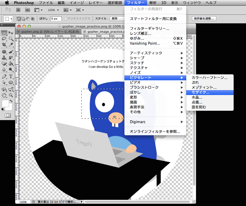
* わかりやすさのために、遷移前後の ImageView の画像を変えています。


android:transitionName に指定した名前を makeSceneTransitionAnimation() でも指定する必要があります。
  1. public class MainActivity extends Activity {  
  2.   
  3.     ...  
  4.   
  5.     private void gotoSub() {  
  6.         ImageView iv = (ImageView) findViewById(R.id.image);  
  7.         Intent intent = new Intent(this, SubActivity.class);  
  8.         startActivity(intent,   
  9.             ActivityOptions.makeSceneTransitionAnimation(this, iv, "image").toBundle());  
  10.     }  
  11. }  


android:transitionName を使わずにコードで指定することもできます。
  1. public class MainActivity extends Activity {  
  2.   
  3.     ...  
  4.   
  5.     private void gotoSub() {  
  6.         ImageView iv = (ImageView) findViewById(R.id.image);  
  7.         String sharedElementName = "image";  
  8.         iv.setTransitionName(sharedElementName);  
  9.           
  10.         Intent intent = new Intent(this, SubActivity.class);  
  11.         startActivity(intent,   
  12.             ActivityOptions.makeSceneTransitionAnimation(this, iv, sharedElementName)  
  13.             .toBundle());  
  14.     }  
  15. }  
  1. public class SubActivity extends Activity {  
  2.   
  3.     @Override  
  4.     protected void onCreate(Bundle savedInstanceState) {  
  5.         super.onCreate(savedInstanceState);  
  6.         setContentView(R.layout.activity_sub);  
  7.   
  8.         String sharedElementName = "image";  
  9.         findViewById(R.id.image).setTransitionName(sharedElementName);  
  10.     }  
  11. }  


5. 複数の sharedElement を指定する

複数の View を共通のエレメントとして指定することができます。
  1. public class MainActivity extends Activity {  
  2.   
  3.     ...  
  4.   
  5.     private void gotoSub() {  
  6.         ImageView iv = (ImageView) findViewById(R.id.image);  
  7.         String sharedElementName = "image";  
  8.         iv.setTransitionName(sharedElementName);  
  9.   
  10.         ImageView iv2 = (ImageView) findViewById(R.id.image2);  
  11.         String sharedElementName2 = "image2";  
  12.         iv2.setTransitionName(sharedElementName2);  
  13.   
  14.         Intent intent = new Intent(this, SubActivity.class);  
  15.         startActivity(intent, ActivityOptions.makeSceneTransitionAnimation(this,  
  16.                 new Pair<View, String>(iv, sharedElementName),  
  17.                 new Pair<View, String>(iv2, sharedElementName2))  
  18.                 .toBundle());  
  19.     }  
  20. }  
  1. public class SubActivity extends Activity {  
  2.   
  3.     @Override  
  4.     protected void onCreate(Bundle savedInstanceState) {  
  5.         super.onCreate(savedInstanceState);  
  6.         setContentView(R.layout.activity_sub);  
  7.   
  8.         String sharedElementName = "image";  
  9.         findViewById(R.id.image).setTransitionName(sharedElementName);  
  10.   
  11.         String sharedElementName2 = "image2";  
  12.         findViewById(R.id.image2).setTransitionName(sharedElementName2);  
  13.     }  
  14. }  


6. sharedElement の transition を指定する

sharedElement の transition は setSharedElementEnterTransition()setSharedElementExitTransition() で指定します。その他の transition には setExitTransition() や setEnterTransition() で指定したものが適用されます。

コードで指定する場合
  1. Transition transition = TransitionInflater.from(this).inflateTransition(R.transition.custom);  
  2. getWindow().setSharedElementExitTransition(transition);  
  3. getWindow().setSharedElementEnterTransition(transition);  
XMLで用意した transition リソースから Transition オブジェクトを作るには TransitionInflater を使います。

テーマで指定する場合
  1. <style name="BaseAppTheme" parent="android:Theme.Material">  
  2.   ...  
  3.   <item name="android:windowSharedElementEnterTransition">@transition/custom</item>  
  4.   <item name="android:windowSharedElementExitTransition">@transition/custom</item>  
  5. </style>  
sharedElement のデフォルトの transition は Theme.Material で指定されており、@android:transition/move になっています。
このファイルの中身は次のようになっています。

@android:transition/move
  1. <transitionSet xmlns:android="http://schemas.android.com/apk/res/android">  
  2.     <changeBounds/>  
  3.     <changeTransform/>  
  4.     <changeClipBounds/>  
  5.     <changeImageTransform/>  
  6. </transitionSet>  
changeBounds は View の大きさをアニメーションさせ、changeImageTransform は ImageView にセットされている画像サイズをアニメーションさせます。

transition リソースの書き方は Transition クラスに概要があります。

例えば、@android:transition/move の <transitionSet> に android:transitionOrdering="sequential" を指定すると、各アニメーションが順番に行われます。
res/transition/custom.xml
  1. <?xml version="1.0" encoding="utf-8"?>  
  2. <transitionSet xmlns:android="http://schemas.android.com/apk/res/android"  
  3.     android:transitionOrdering="sequential">  
  4.     <changeBounds />  
  5.     <changeTransform />  
  6.     <changeClipBounds />  
  7.     <changeImageTransform />  
  8. </transitionSet>  


おまけ: デフォルト設定

  1. <style name="Theme.Material">  
  2.     <item name="windowContentTransitions">false</item>  
  3.     <item name="windowEnterTransition">@transition/fade</item>  
  4.     <item name="windowSharedElementEnterTransition">@transition/move</item>  
  5.     <item name="windowSharedElementExitTransition">@transition/move</item>  
  6.     ...  
  7. </style>  
  8.   
  9. <style name="Theme.Material.Light" parent="Theme.Light">  
  10.     <item name="windowContentTransitions">false</item>  
  11.     <item name="windowEnterTransition">@transition/fade</item>  
  12.     <item name="windowSharedElementEnterTransition">@transition/move</item>  
  13.     <item name="windowSharedElementExitTransition">@transition/move</item>  
  14.     ...  
  15. </style>